Discuss Scratch
- Discussion Forums
- » Collaboration
- » AspectOS™ - The Future Starts Here! [ARCHIVED]
![[RSS Feed] [RSS Feed]](//cdn-scratch-mit-edu.ezproxy.canberra.edu.au/scratchr2/static/__9895dded8dba41340e7c64201d2e5d85__//djangobb_forum/img/feed-icon-small.png)
- Kerbalistic
-
 New Scratcher
87 posts
AspectOS™ - The Future Starts Here! [ARCHIVED]
(#9621)
Alright let's compare 10 OSes to each other ok
In terms of what the navbar looks like
Here are the contestants
- Blue OS (2020)
- ScratchOS (Featured One on Scratch)
- Oryx OS BETA
- Fabricon OS Anniversary Update
- Orange OS (2021)
- Red OS (2020)
- Amber OS (2020)
- Green OS (2020)
RIP my computer
—SNIP—
And besides, mobile users really shouldn't be using our OS for v2.0 since it is more of a PC project than a mobile-friendly type of project. But that is why we have aOS Mobile coming soon (hopefully. how are we doing toast)
just saying out of all of these i think Oryx OS looks the best
and who is going to be the one to not snip
Last edited by Kerbalistic (Feb. 16, 2022 23:14:15)
- AIGamesDeveloper
-
 Scratcher
1000+ posts
AspectOS™ - The Future Starts Here! [ARCHIVED]
-snip-I reworked it due to a bug and I have a menu thingymabob
And besides, mobile users really shouldn't be using our OS for v2.0 since it is more of a PC project than a mobile-friendly type of project. But that is why we have aOS Mobile coming soon (hopefully. how are we doing toast)
PLEASE SNIP THIS QUOTE BEFORE REPLYING TO IT!
Great!

- I_LOVE_TO_MAKE_STUFF
-
 Scratcher
1000+ posts
AspectOS™ - The Future Starts Here! [ARCHIVED]
PLEASE SNIP THIS QUOTE BEFORE REPLYING TO IT!Darn it! I can't see the images! Also, weren't you snipophobic
-snip-
PLEASE SNIP THIS QUOTE BEFORE REPLYING TO IT!
- AIGamesDeveloper
-
 Scratcher
1000+ posts
AspectOS™ - The Future Starts Here! [ARCHIVED]
PLEASE SNIP THIS QUOTE BEFORE REPLYING TO IT!Darn it! I can't see the images! Also, weren't you snipophobic
-snip-
PLEASE SNIP THIS QUOTE BEFORE REPLYING TO IT!
Yeah, I am. which is why I said it two times
Also, oof then
Also, they are all together!

- qloakonscratch
-
 Scratcher
1000+ posts
AspectOS™ - The Future Starts Here! [ARCHIVED]
Anything look wrong with that photo?PLEASE SNIP THIS QUOTE BEFORE REPLYING TO IT!Darn it! I can't see the images! Also, weren't you snipophobic
-snip-
PLEASE SNIP THIS QUOTE BEFORE REPLYING TO IT!
Yeah, I am. which is why I said it two times
Also, oof then
Also, they are all together!
- I_LOVE_TO_MAKE_STUFF
-
 Scratcher
1000+ posts
AspectOS™ - The Future Starts Here! [ARCHIVED]
Yes, I can't see it. By now it's normalAnything look wrong with that photo?PLEASE SNIP THIS QUOTE BEFORE REPLYING TO IT!Darn it! I can't see the images! Also, weren't you snipophobic
-snip-
PLEASE SNIP THIS QUOTE BEFORE REPLYING TO IT!
Yeah, I am. which is why I said it two times
Also, oof then
Also, they are all together!
- AIGamesDeveloper
-
 Scratcher
1000+ posts
AspectOS™ - The Future Starts Here! [ARCHIVED]
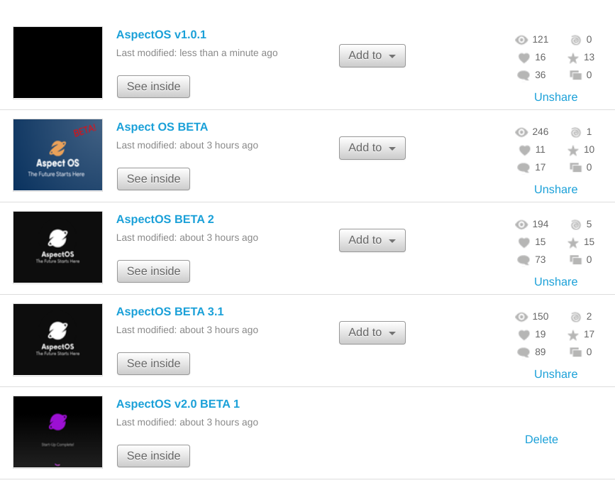
Does anything look wrong with that photo?
BETA 1 logo?
BETA 1 has more views?
Order is wrong?
Last edited by AIGamesDeveloper (Feb. 17, 2022 04:50:49)
- mbrick2
-
 Scratcher
1000+ posts
AspectOS™ - The Future Starts Here! [ARCHIVED]
Glass UI? eww!Glass UI rules. Also why don't we use replit. Its soooo useful
- mbrick2
-
 Scratcher
1000+ posts
AspectOS™ - The Future Starts Here! [ARCHIVED]
(#9628)eeekYes, I can't see it. By now it's normalAnything look wrong with that photo?PLEASE SNIP THIS QUOTE BEFORE REPLYING TO IT!Darn it! I can't see the images! Also, weren't you snipophobic
-snip-
PLEASE SNIP THIS QUOTE BEFORE REPLYING TO IT!
Yeah, I am. which is why I said it two times
Also, oof then
Also, they are all together!
- qloakonscratch
-
 Scratcher
1000+ posts
AspectOS™ - The Future Starts Here! [ARCHIVED]
BETA 3.1 has more comments than BETA 1, but then look at the view counts of both.Does anything look wrong with that photo?
BETA 1 logo?
BETA 1 has more views?
Order is wrong?
- AIGamesDeveloper
-
 Scratcher
1000+ posts
AspectOS™ - The Future Starts Here! [ARCHIVED]
BETA 3.1 has more comments than BETA 1, but then look at the view counts of both.Does anything look wrong with that photo?
BETA 1 logo?
BETA 1 has more views?
Order is wrong?
lol people viewed more BETA 1 than BETA 3
- qloakonscratch
-
 Scratcher
1000+ posts
AspectOS™ - The Future Starts Here! [ARCHIVED]
but HOW ARE THERE MORE COMMENTS on one that GOT LESS VIEWS?!?!?!!??!?BETA 3.1 has more comments than BETA 1, but then look at the view counts of both.Does anything look wrong with that photo?
BETA 1 logo?
BETA 1 has more views?
Order is wrong?
lol people viewed more BETA 1 than BETA 3
- mbrick2
-
 Scratcher
1000+ posts
AspectOS™ - The Future Starts Here! [ARCHIVED]
(image provided by DuckDuckGo)ah macos looks like
-macos image snippy-

- AIGamesDeveloper
-
 Scratcher
1000+ posts
AspectOS™ - The Future Starts Here! [ARCHIVED]
(image provided by DuckDuckGo)ah macos looks like
-macos image snippy-
Rounded Sqaure
Apps on the bottom
See? Our layout looks like MacOS!
I don't see a problem with our app dock so far.
And the fact that you can change the place where the nav bar can be as well is good as well!
- AJ-Scratch-AJ
-
 Scratcher
500+ posts
AspectOS™ - The Future Starts Here! [ARCHIVED]
(#9637)Why does almost every advanced scratch OS look like Mac (I mean..rounded + nav on bottom)?(image provided by DuckDuckGo)ah macos looks like
-macos image snippy-
Rounded Sqaure
Apps on the bottom
See? Our layout looks like MacOS!
I don't see a problem with our app dock so far.
And the fact that you can change the place where the nav bar can be as well is good as well!
Out of all of those..I like Fabricon the best, simplicity along with originality is key.
Last edited by AJ-Scratch-AJ (Feb. 17, 2022 05:28:43)
- qloakonscratch
-
 Scratcher
1000+ posts
AspectOS™ - The Future Starts Here! [ARCHIVED]
Now, what is it about Mac OS X that I hate with a passion? One major thing I absolutely despise about Mac OS X is the pure, inane, lowest-common-denomination, inflexible, easy to learn YET HARD TO USE UI.(source)
Might have to change it.
- mbrick2
-
 Scratcher
1000+ posts
AspectOS™ - The Future Starts Here! [ARCHIVED]
Might have to change it.macOS UI rulz (big sur+ at least)
- mbrick2
-
 Scratcher
1000+ posts
AspectOS™ - The Future Starts Here! [ARCHIVED]
(#9638)coz macOS looks sick(#9637)Why does almost every advanced scratch OS look like Mac (I mean..rounded + nav on bottom)?(image provided by DuckDuckGo)ah macos looks like
-macos image snippy-
Rounded Sqaure
Apps on the bottom
See? Our layout looks like MacOS!
I don't see a problem with our app dock so far.
And the fact that you can change the place where the nav bar can be as well is good as well!
Out of all of those..I like Fabricon the best, simplicity along with originality is key.
(#9639)Thats oudated OS XNow, what is it about Mac OS X that I hate with a passion? One major thing I absolutely despise about Mac OS X is the pure, inane, lowest-common-denomination, inflexible, easy to learn YET HARD TO USE UI.(source)
Might have to change it.
I don't see a problem with our app dock so far.I never said anything against it
- qloakonscratch
-
 Scratcher
1000+ posts
AspectOS™ - The Future Starts Here! [ARCHIVED]
macOS is overrated, I've used it my entire life, and yet I still can't see why people favor it over Linux.


