Discuss Scratch

- Discussion Forums
- » Bugs and Glitches
- » Color Consistiencies in Accessibility Update List
![[RSS Feed]](//mv-ezproxy-com.ezproxy.canberra.edu.au/scratchr2/static/__f17a70240ea1b997b429416c7f10eabf__//djangobb_forum/img/feed-icon-small.png "[RSS Feed]")
- p-p-p-p-p-p-p-p-p-p-
-
 Scratcher

1000+ posts
Color Consistiencies in Accessibility Update List
Heres a list of the inconsistencies I among others have found, that may want to be fixed:
On that number-type thing in high-contrast mode, the text is still white (low contrast).
Comment/Forum Borders
This is a normal comment. In 3.0 pages, the aura around the comment is purple. However, check out the border on 2.0 pages:
It's blue.
This is similar for forum posts, like this:


Changing Feature Project Border
Similar to the bug above, changing your featured project border is also blue:

Pin and Unread notifications are still blue
These icons in the forum topic list pages are still blue:- the pin
- the icon
Unread Messages are Still Blue
Moderator notifications will still show up as purple, like this:
Unfortunately, normal notifications show up like this:
The text is purple though.


On read notifications, icons are greyed out
If you can see above, the little icon in the top left corner of the first message is dark blue in contrast to the light blue, but in read messages, like the message below, these icons are greyed out. I think this is likely an intentional feature, but it should definitely be changed if we are promoting visibility. Here are the grayed out icons for reference:


Loading screens are still blue
Sorry about the screenshot, I had to rush to take it.
This one pretty much speaks for itself.

Scratch Trailer still uses Blue
This is a really small one and idk if it should even be changed, but the trailer for scratch uses the color blue instead of purple lol.

Contact Us Popup still uses Blue
Kinda feels off when the entire page is purple except for the one blue thing

Inconsistent Search Bar
The old search bar:
The new one:
The fixed search bar (hex color: #714eb6):


Join Scratch Menu is a mix of blue and purple
hold off till you see this

https://scratch-mit-edu.ezproxy.canberra.edu.au/parents/ uses blue, even though the header is purple

Links are still blue when you press the preview button:

All of the popups on project pages are still blue.


The remix button on the project page is a darker color.
However, when you go into the editor, the remix button is still the lighter green color.


Trouble and Planned Maintenance pages still use the blue color
https://scratch-mit-edu.ezproxy.canberra.edu.au/cdn/trouble.html and https://scratch-mit-edu.ezproxy.canberra.edu.au/cdn/maintenance.html are still using the shade of blue from the old scratch.
Issues with the Settings Page
The “Whoops, go back” arrow on the account deletion page is still blue
The radio highlight box shadow on the account deletion page is still blue
“You have updated your account settings” is blue


FIXED BUGS:IF YOU FIND ANYMORE ISSUES, PLEASE POST THEM HERE
Forum Headers Have Blue instead of Purple
2.0 Pages will occasionally render as blue
Follow Discussion icon is bugged out
Thank you scratch team for paying attention and fixing these bugs!
Last edited by p-p-p-p-p-p-p-p-p-p- (July 27, 2023 00:34:46)
New!

- -OdysseyCentral-
-
 Scratcher

1000+ posts
Color Consistiencies in Accessibility Update List
Can all of forums please be purple, and comment aura when in a message text box in profiles be purple too? The little inconsistencies are a little annoying.They are now, so probably gonna be closed as it’s implemented.
Thanks!
Edit: noticed it’s mostly implemented, so that’s a bump actually
,
Last edited by -OdysseyCentral- (June 28, 2023 15:12:07)
 The Honey Shop is back! Check us out on the Requests forum!
=== 1:37 ───ㅇ───── 4.01 ↻ Previous Song: Battle on The Great Tower◁ II ▷Next song: Ground (SMW) ↺. ♬ ♪ ♩===
- jvvg
-
 Scratcher

1000+ posts
Color Consistiencies in Accessibility Update List
My guess is that these were things that they missed when developing the changes. To help them find and fix them, point out as many specific ones as you can. Examples I notice are the post headers, pin and unread message icons, and “follow discussion” buttons.

- RealNF27
-
 Scratcher

4 posts
Color Consistiencies in Accessibility Update List
I love how people are making a blue-purple war. its sad of the blue-lovers to not realise that scratch could get sued for not being inclusive.
- cs3868895
-
 Scratcher

1000+ posts
Color Consistiencies in Accessibility Update List
It's not all now, because there is still blue circles lolCan all of forums please be purple, and comment aura when in a message text box in profiles be purple too? The little inconsistencies are a little annoying.They are now, so probably gonna be closed as it’s implemented.
Thanks!
Edit: noticed it’s mostly implemented, so that’s a bump actually
,
Fish more ideas
I'm Fishy a cis bi female.
sorry, but as of currently, I'm moving platforms, I can't handle the drama.
I'm Fishy a cis bi female.
sorry, but as of currently, I'm moving platforms, I can't handle the drama.
- p-p-p-p-p-p-p-p-p-p-
-
Scratcher
1000+ posts
Color Consistiencies in Accessibility Update List
Can we move this to bugs and glitches?
Here are some more inconsistencies:
Login button on 2.0 pages looks just like the follow discussion button
Unread comments in https://scratch-mit-edu.ezproxy.canberra.edu.au are shaded blue instead of purple (but ST notifications are purple)
The comment icon in the message page is blue (forum icon is purple so i was assuming this would be updated too, more on that below)
Suggestions:
Change the submit button on forums to be more accessible, It’s a little funny.
Change the comments icon in messages (https://scratch-mit-edu.ezproxy.canberra.edu.au/svgs/messages/comment.svg) to be darker, because right now it blends in with messages.
New!
- p-p-p-p-p-p-p-p-p-p-
-
Scratcher
1000+ posts
Color Consistiencies in Accessibility Update List
bumppp
New!
- SidewaysCoder
-
 Scratcher

500+ posts
Color Consistiencies in Accessibility Update List
The Support box on the Contact Us page still has a blue theme.
The dotted outline around editable text in the project pages is still blue.
The dotted outline around editable text in the project pages is still blue.
Last edited by SidewaysCoder (June 28, 2023 18:53:20)

You know it's a problem when Scratch returns HTTP error 688
- Maximouse
-
 Scratcher

1000+ posts
Color Consistiencies in Accessibility Update List
The dotted outline around editable text in the project pages is still blue.That might actually be intentional, like the light blue background in the editor and on the studio page.

- p-p-p-p-p-p-p-p-p-p-
-
Scratcher
1000+ posts
Color Consistiencies in Accessibility Update List
But its not in 3.0 comments or anything in studios so I'm not sure about that.The dotted outline around editable text in the project pages is still blue.That might actually be intentional, like the light blue background in the editor and on the studio page.
EDIT: Nvm I don't understand what the OP is talking about, it works as intended for me.
Last edited by p-p-p-p-p-p-p-p-p-p- (June 28, 2023 19:03:22)
New!
- p-p-p-p-p-p-p-p-p-p-
-
Scratcher
1000+ posts
Color Consistiencies in Accessibility Update List
Check out that blue pin next to my forum post. It’s a glitch. But it also means we’re stickied.
Could we possibly get an update from a developer at scratch to know what ones of these are looking into being fixed and which ones are intentional? That would help refine this list.
Thanks!
Could we possibly get an update from a developer at scratch to know what ones of these are looking into being fixed and which ones are intentional? That would help refine this list.
Thanks!
New!
- medians
-
 Scratcher

1000+ posts
Color Consistiencies in Accessibility Update List
That Scratch trailer must be an older one because it still uses Tips and the red report button, so.. (I think I remember the red report button being in 3.0, not sure when they changed it or why)
Anyway, I think they didn't change the color on notifications because of the link color being purple. I wish I could bring back the old styled page though, and a lot more changes.
Also, I'm not sure if this is one of my extensions, but the forum borders were still blue for me, as well as on comments.
Medians bamboozled by 3.0 (version 3.0): https://scratch-mit-edu.ezproxy.canberra.edu.au/projects/979822351/
hi875230163394: You're similar to valve in that you both hate a certain number…
Scratch 0.x, 1.x, 2.x, 3.x and LogoBlocks Archives
Bamboozlement: https://scratch-mit-edu.ezproxy.canberra.edu.au/studios/33739789
Describe favorite topics: https://scratch-mit-edu.ezproxy.canberra.edu.au/studios/35764610/
SP community won against Fandom :P
Years on internet: 16 (very close to 16)
medians: Oh god not this utc - 12 thing again..
Fun_Cupcake_i81: What, were you expecting not to see the utc - 12 thing again? THE UTC - 12 THIGN ALWAYS RETURNS. ALWAYS.
medians: I knew it would happen. I was the one who started it last year.
Fun_Cupcake_i81: Well then if you didn't want it back maybe you need to time travel to last year and fix that
Oh wait if you could time travel I think we all know exactly when you would go-
user1: That picture is from 2.0. Now he’s at my house and is my pet.
user2: But this is medians we're talking about, so “from 2.0” can mean the same thing as “from five seconds ago”.
Detect Scratch version here
My other accounts: @selfexplanatory @modesties @chaircard @fireflyhero @dividendyield @colloids @radians @skeuamorphism @dihectogon @anglebisector @aau- @EditBlockColors @AdamantOrb @MoongeistBeam @festively @Ampharos_ @straightforwardness @interchangeably
i trolled redcat LOL
if you see this
{what method did you use::control hat
answer on profile ::motion
} ::operators
;
- SidewaysCoder
-
Scratcher
500+ posts
Color Consistiencies in Accessibility Update List
EDIT: Nvm I don't understand what the OP is talking about, it works as intended for me.There's a blue dotted border around editable text boxes on project pages, like this:

That might actually be intentional, like the light blue background in the editor and on the studio page.When you click on it, the border turns purple and has a halo, so is it supposed to be purple?

Here's some more inconsistencies that I spotted:
* The tutorials show the old 3.0 editor.
* The “Around the World” section in the About page has a picture with white on blue.
* The Scratch-www section on the Developers page and the Starter Projects section on the Ideas page has the old 3.0-style sketches
You know it's a problem when Scratch returns HTTP error 688
- p-p-p-p-p-p-p-p-p-p-
-
Scratcher
1000+ posts
Color Consistiencies in Accessibility Update List
I think the first one is intentional, and I don’t think the other ones have an easy fix.EDIT: Nvm I don't understand what the OP is talking about, it works as intended for me.There's a blue dotted border around editable text boxes on project pages, like this:That might actually be intentional, like the light blue background in the editor and on the studio page.When you click on it, the border turns purple and has a halo, so is it supposed to be purple?
Here's some more inconsistencies that I spotted:
* The tutorials show the old 3.0 editor.
* The “Around the World” section in the About page has a picture with white on blue.
* The Scratch-www section on the Developers page and the Starter Projects section on the Ideas page has the old 3.0-style sketches
New!
- -Zorra-
-
 Scratcher

100+ posts
Color Consistiencies in Accessibility Update List
I think I noticed another, half the crash message from the editing screen is purple and the other's blue.
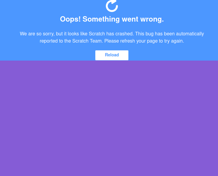
Last edited by -Zorra- (June 29, 2023 12:33:34)
Ehēu… ova!
200 posts until 1,000! :D
- medians
-
Scratcher
1000+ posts
Color Consistiencies in Accessibility Update List
I can replicate with a project by me that only works in 2.0 and turbowarp, except I can't see purple at all:
https://scratch-mit-edu.ezproxy.canberra.edu.au/projects/810769530
https://scratch-mit-edu.ezproxy.canberra.edu.au/projects/810769530
Medians bamboozled by 3.0 (version 3.0): https://scratch-mit-edu.ezproxy.canberra.edu.au/projects/979822351/
hi875230163394: You're similar to valve in that you both hate a certain number…
Scratch 0.x, 1.x, 2.x, 3.x and LogoBlocks Archives
Bamboozlement: https://scratch-mit-edu.ezproxy.canberra.edu.au/studios/33739789
Describe favorite topics: https://scratch-mit-edu.ezproxy.canberra.edu.au/studios/35764610/
SP community won against Fandom :P
Years on internet: 16 (very close to 16)
medians: Oh god not this utc - 12 thing again..
Fun_Cupcake_i81: What, were you expecting not to see the utc - 12 thing again? THE UTC - 12 THIGN ALWAYS RETURNS. ALWAYS.
medians: I knew it would happen. I was the one who started it last year.
Fun_Cupcake_i81: Well then if you didn't want it back maybe you need to time travel to last year and fix that
Oh wait if you could time travel I think we all know exactly when you would go-
user1: That picture is from 2.0. Now he’s at my house and is my pet.
user2: But this is medians we're talking about, so “from 2.0” can mean the same thing as “from five seconds ago”.
Detect Scratch version here
My other accounts: @selfexplanatory @modesties @chaircard @fireflyhero @dividendyield @colloids @radians @skeuamorphism @dihectogon @anglebisector @aau- @EditBlockColors @AdamantOrb @MoongeistBeam @festively @Ampharos_ @straightforwardness @interchangeably
i trolled redcat LOL
if you see this
{what method did you use::control hat
answer on profile ::motion
} ::operators
;
- -Zorra-
-
Scratcher
100+ posts
Color Consistiencies in Accessibility Update List
I can replicate with a project by me that only works in 2.0 and turbowarp, except I can't see purple at all:
https://scratch-mit-edu.ezproxy.canberra.edu.au/projects/810769530
I forgot to clarify, it only turns purple if you click “see inside”
Ehēu… ova!
200 posts until 1,000! :D
- medians
-
Scratcher
1000+ posts
Color Consistiencies in Accessibility Update List
I did that but didn't see purple by the way, it displays the same way as before the update, but it could also just be my extensions.I can replicate with a project by me that only works in 2.0 and turbowarp, except I can't see purple at all:
https://scratch-mit-edu.ezproxy.canberra.edu.au/projects/810769530
I forgot to clarify, it only turns purple if you click “see inside”
Anyway, hopefully my progress bar, record button, colors, whatever else are fixed soon.
Medians bamboozled by 3.0 (version 3.0): https://scratch-mit-edu.ezproxy.canberra.edu.au/projects/979822351/
hi875230163394: You're similar to valve in that you both hate a certain number…
Scratch 0.x, 1.x, 2.x, 3.x and LogoBlocks Archives
Bamboozlement: https://scratch-mit-edu.ezproxy.canberra.edu.au/studios/33739789
Describe favorite topics: https://scratch-mit-edu.ezproxy.canberra.edu.au/studios/35764610/
SP community won against Fandom :P
Years on internet: 16 (very close to 16)
medians: Oh god not this utc - 12 thing again..
Fun_Cupcake_i81: What, were you expecting not to see the utc - 12 thing again? THE UTC - 12 THIGN ALWAYS RETURNS. ALWAYS.
medians: I knew it would happen. I was the one who started it last year.
Fun_Cupcake_i81: Well then if you didn't want it back maybe you need to time travel to last year and fix that
Oh wait if you could time travel I think we all know exactly when you would go-
user1: That picture is from 2.0. Now he’s at my house and is my pet.
user2: But this is medians we're talking about, so “from 2.0” can mean the same thing as “from five seconds ago”.
Detect Scratch version here
My other accounts: @selfexplanatory @modesties @chaircard @fireflyhero @dividendyield @colloids @radians @skeuamorphism @dihectogon @anglebisector @aau- @EditBlockColors @AdamantOrb @MoongeistBeam @festively @Ampharos_ @straightforwardness @interchangeably
i trolled redcat LOL
if you see this
{what method did you use::control hat
answer on profile ::motion
} ::operators
;
- -ElectronicArts-
-
 Scratcher

1000+ posts
Color Consistiencies in Accessibility Update List
Can you repost whats inside my post? its kind of big. https://scratch-mit-edu.ezproxy.canberra.edu.au/discuss/post/7343270/

- p-p-p-p-p-p-p-p-p-p-
-
Scratcher
1000+ posts
Color Consistiencies in Accessibility Update List
Can you repost whats inside my post? its kind of big. https://scratch-mit-edu.ezproxy.canberra.edu.au/discuss/post/7343270/First image is already reported, second image is intentional or I'm missing something wrong with it, and I added the third one.
Thanks for the help!
New!
- Discussion Forums
- » Bugs and Glitches
-
» Color Consistiencies in Accessibility Update List